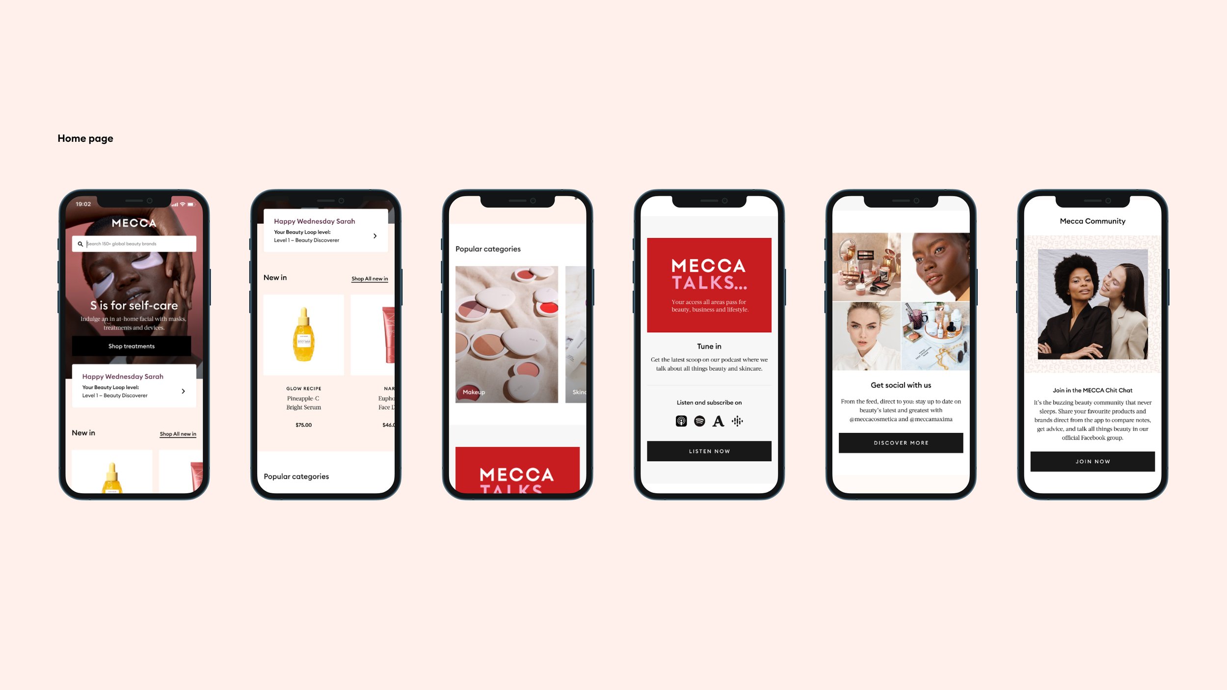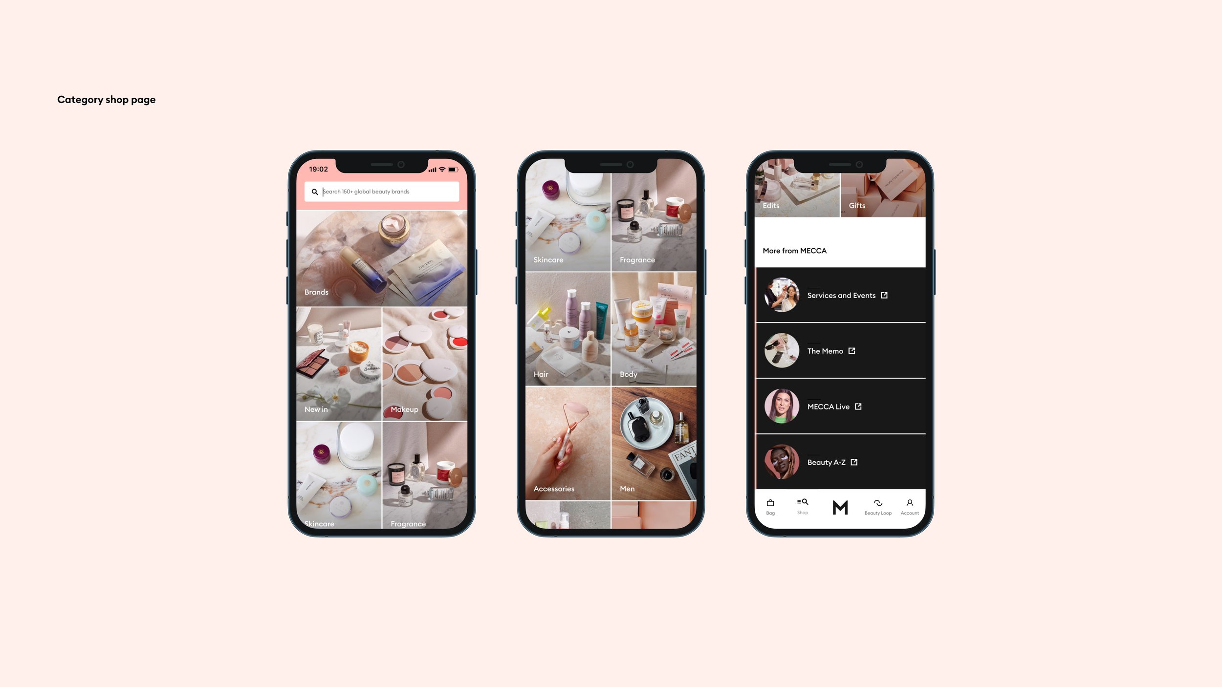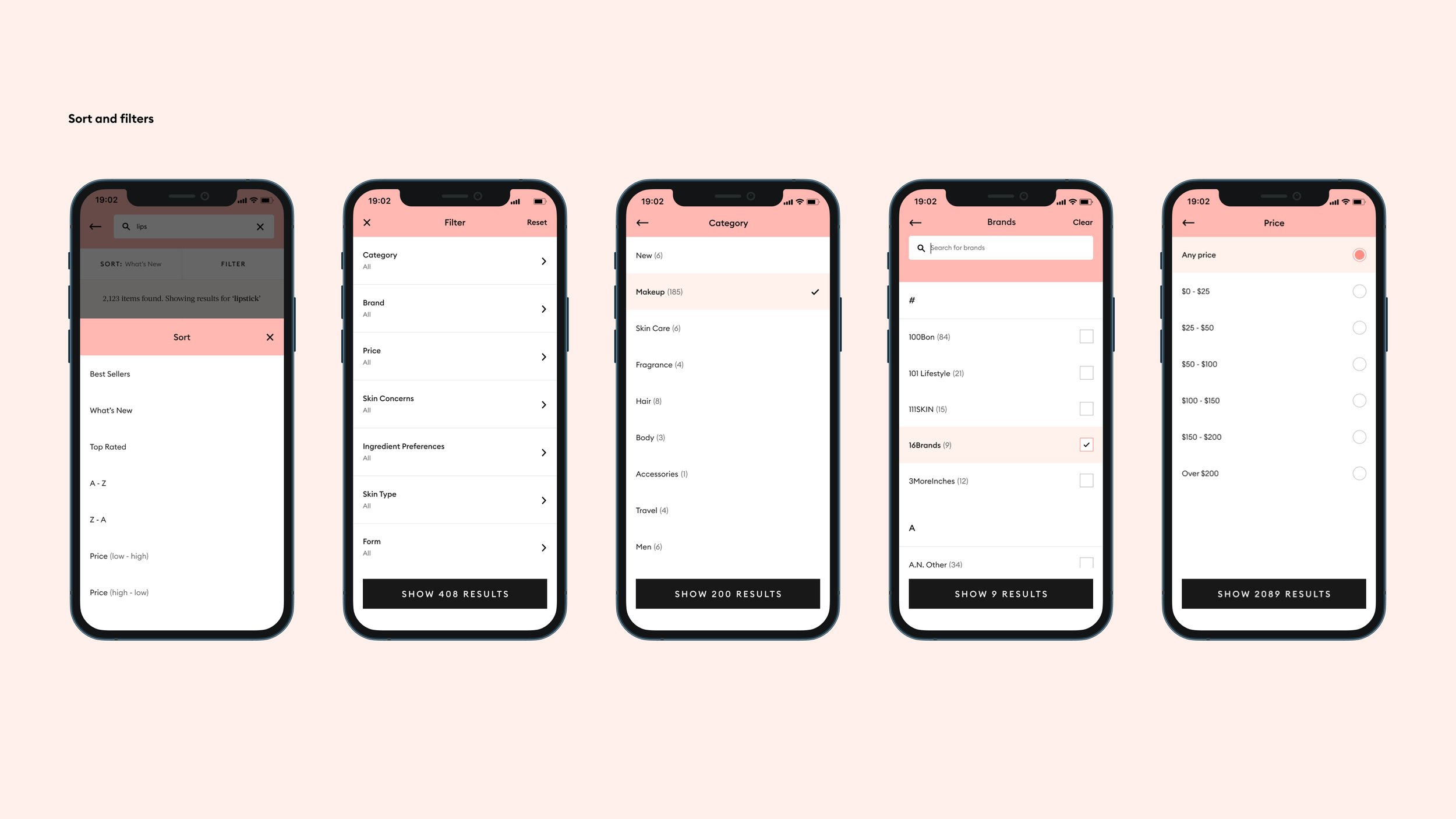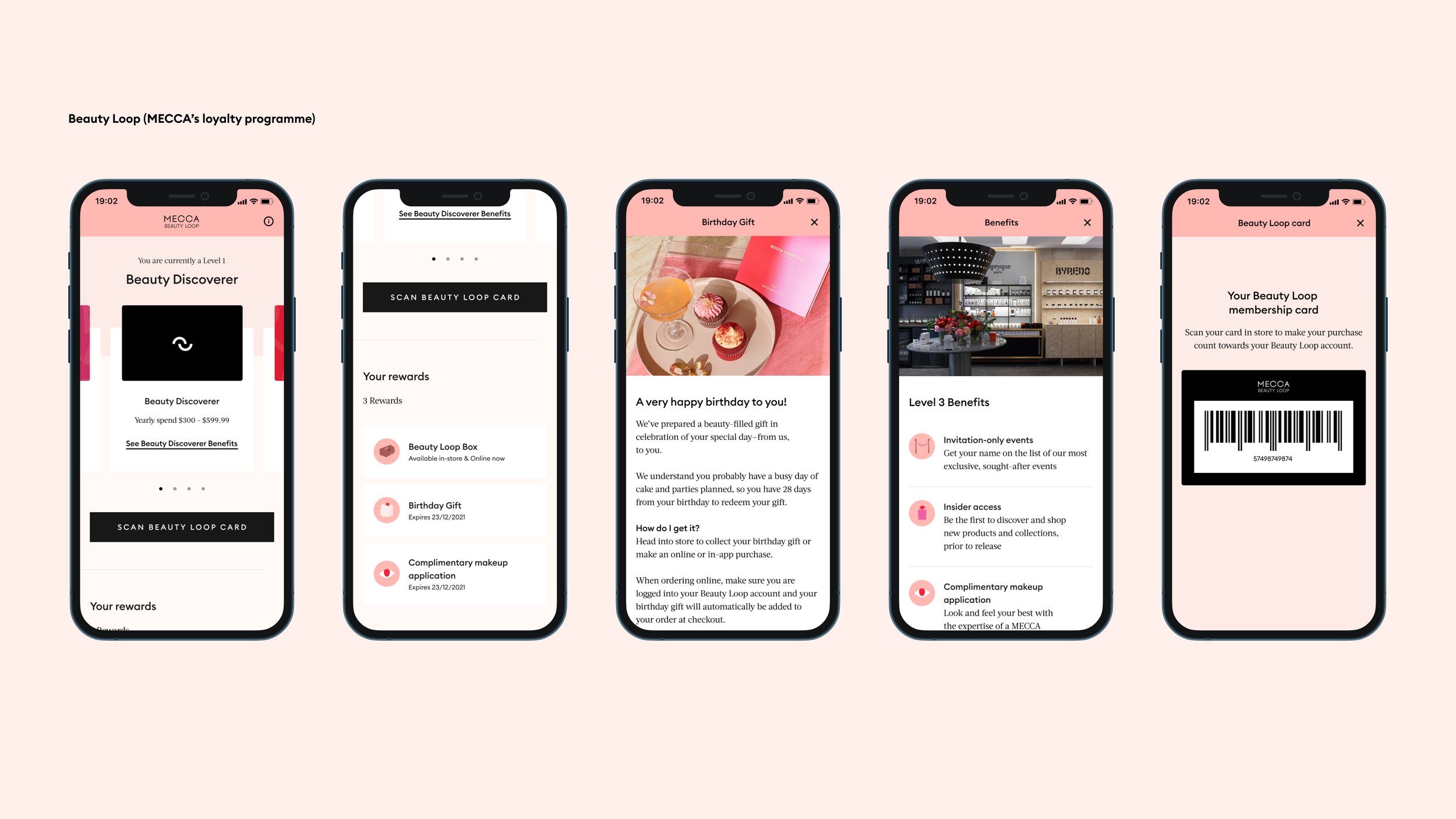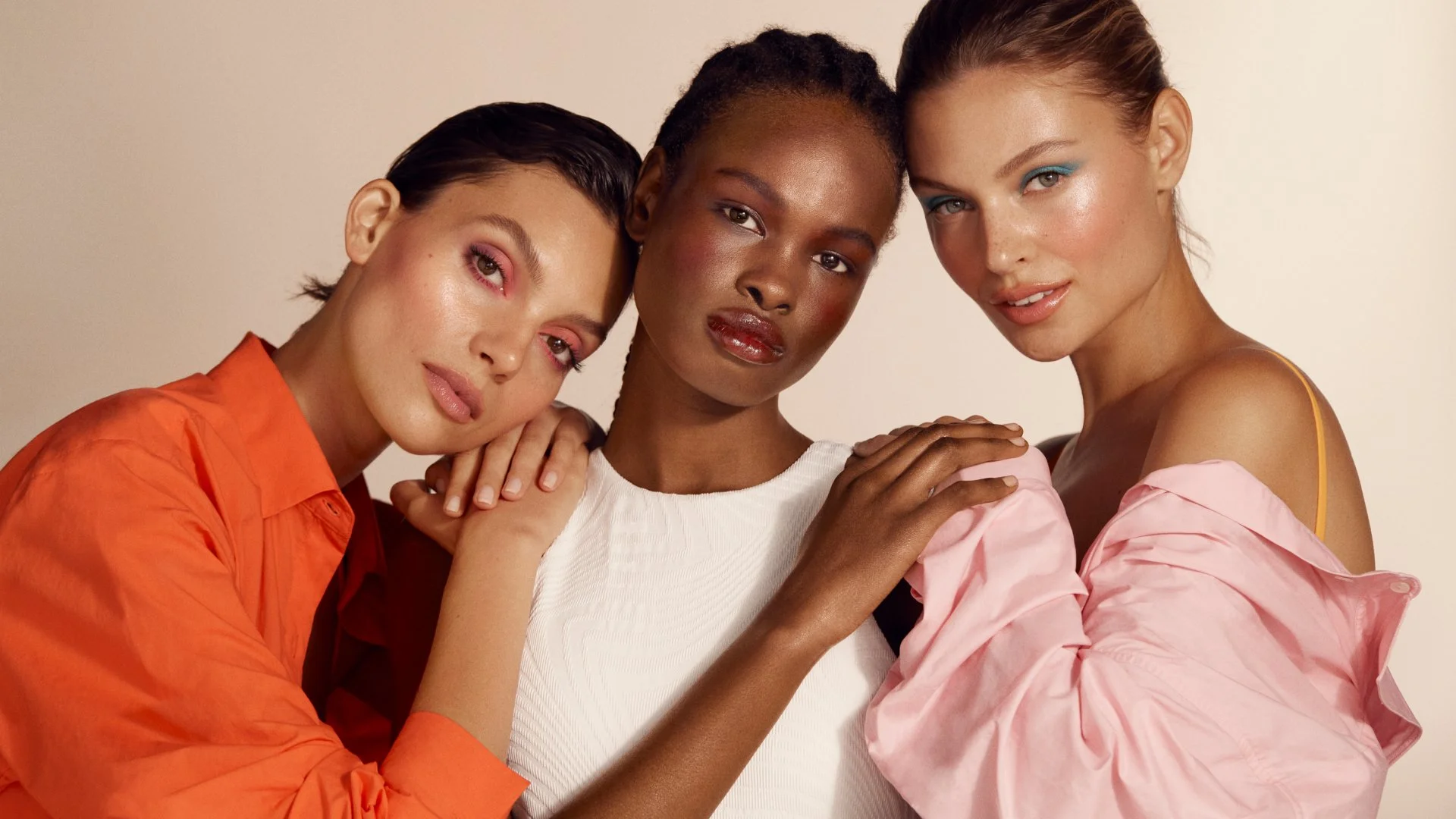
The MECCA app
I had the privilege to lead the app's UI design, working closely with our talented UX team. My role was to bring the MECCA brand into the digital space.
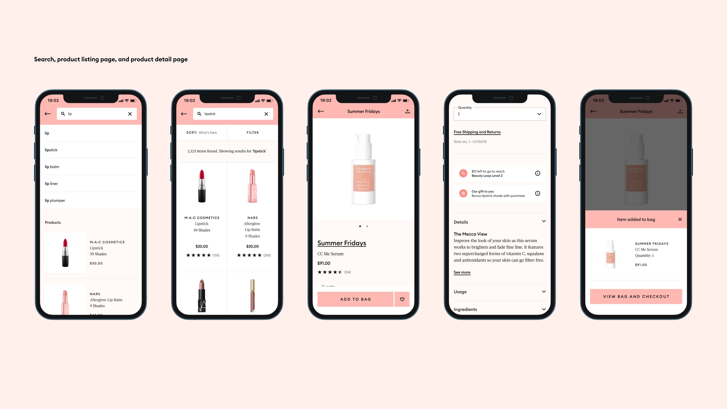
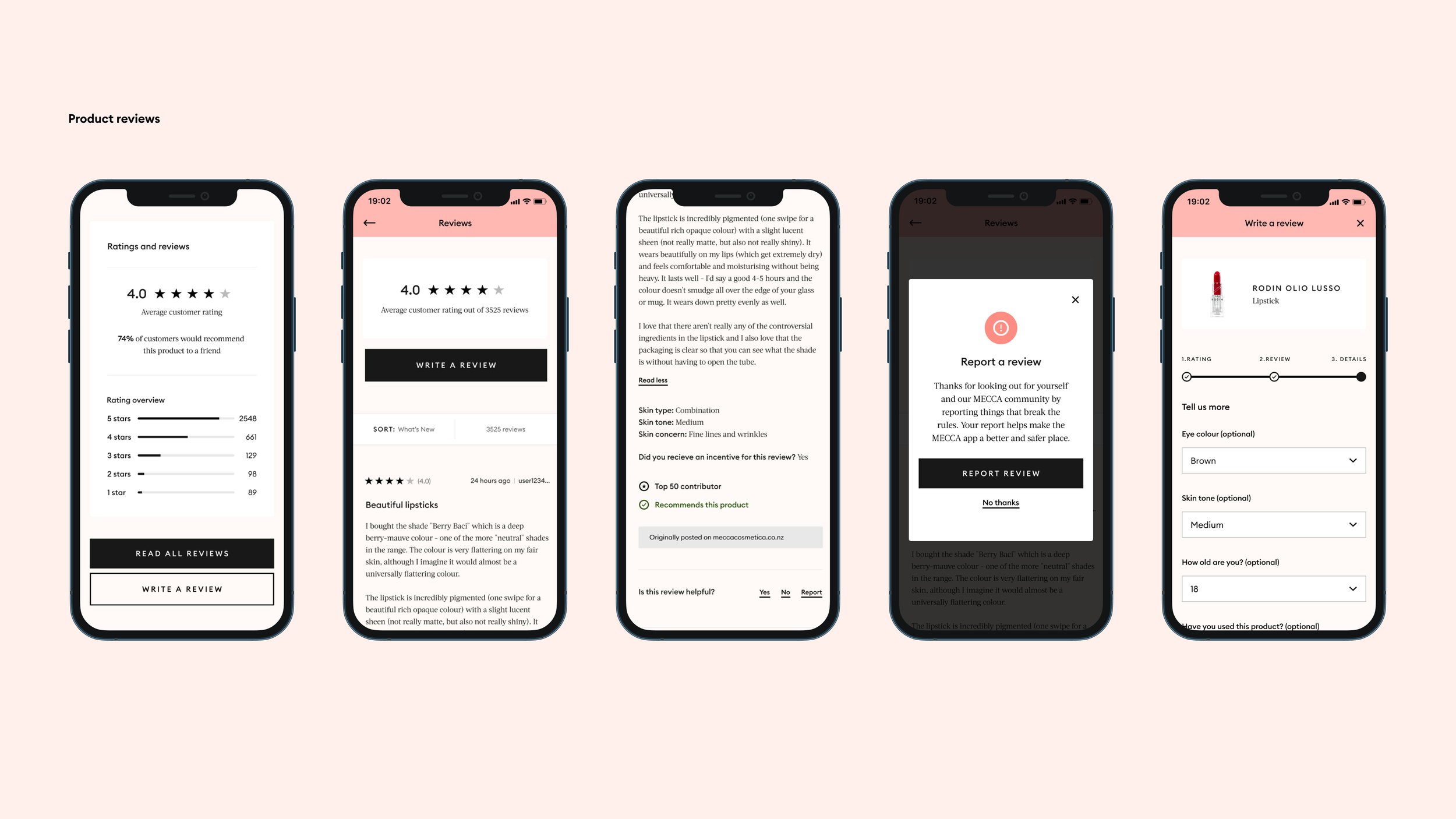
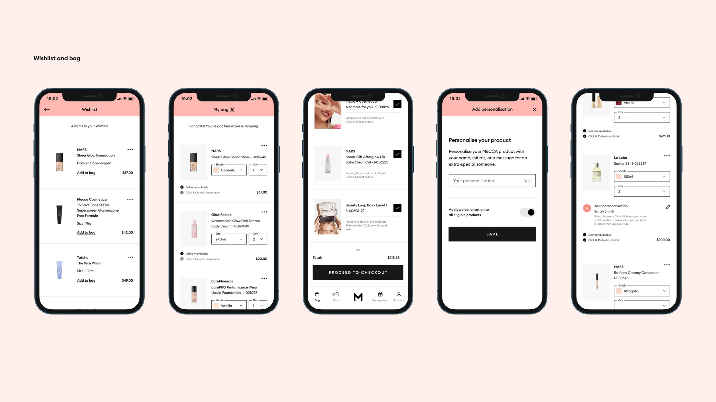
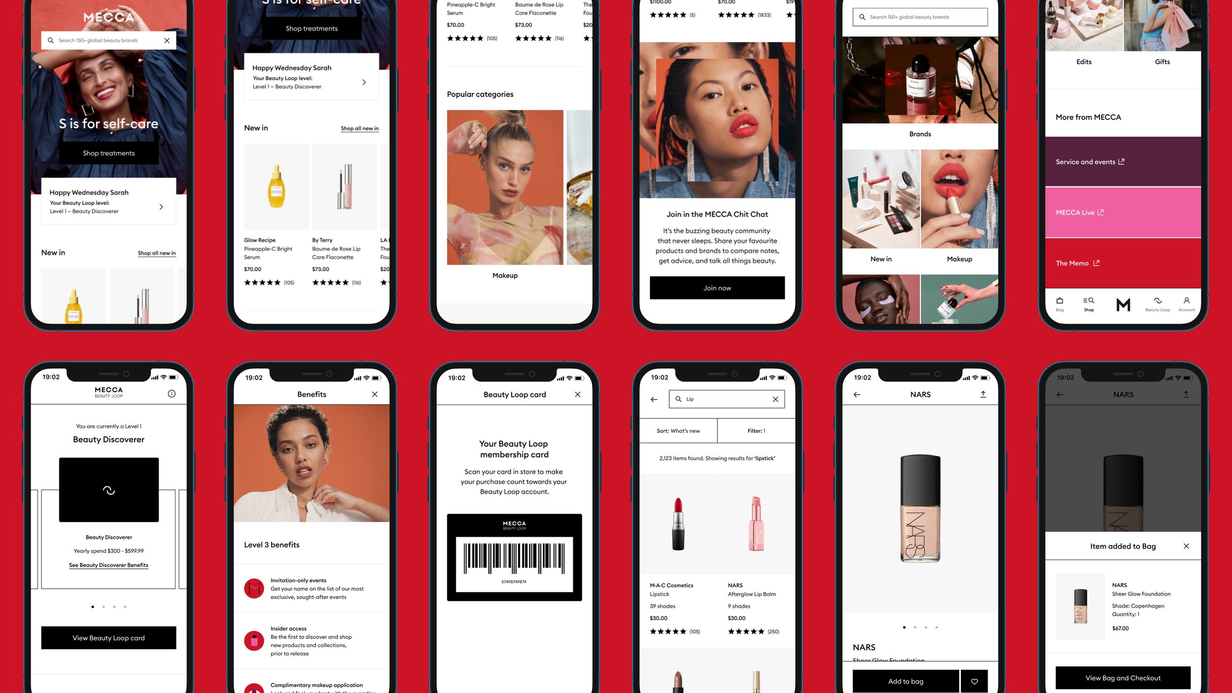
The app has features like ease of shopping, saving products, access to product ratings and reviews, details about MECCA's loyalty program (Beauty Loop), a shake feature to display your Beauty Loop card in-store, and many more.
Our primary focus was to ensure that customers have an easy, fuss-free shopping experience, so we opted for a clean and simple user interface.
Around the midpoint of our journey, we decided to refresh the brand's look and feel. Collaborating with the brand design team, we gradually removed the signature pink and blush tones. This strategic shift allowed us to spotlight vibrant, bold imagery and embrace a more minimalist design approach, as seen in the app's designs with those red backgrounds.
Skills, outputs, and deliverables:
- Competitor analysis review
- Design direction
- UI design
- User testing
- Light touch UX flows
- Stakeholder management
- Data analysis for continuous improvement
- Interactive prototypes
- Creating and maintaining the design system
- Accessibility documentation
- Developer specs for handover
- Content spec documentation
- Ways of working with developers
- Design reviews of the build using Jira and Confluence
